Design by, with, and for Neurodivergent Learners: Part 2 — Computational Thinking Posters
By Teon Edwards
Educational posters seem to be everywhere. Some are well designed, others not so much. A poorly designed poster fails to communicate clearly, with such design mistakes as using hard to read text, distracting backgrounds, cluttered layouts, or unnecessary or confusing images. We made a conscious decision to carefully design our posters, as poor designs are never good, but they can be especially problematic for some neurodivergent learners.
As part of two projects, CodePlay (NSF; #1738574) and INFACT (DOE; EIR-U411C190179), our teams carefully designed several sets of computational thinking (CT) posters for teachers to not just hang on their walls, but to refer to and use in their lessons.
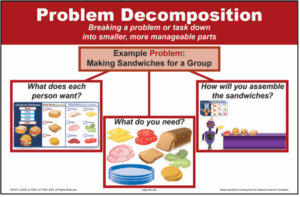
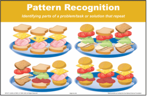
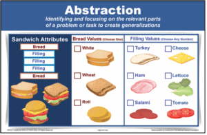
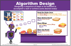
The posters were thoughtfully designed.
- A single topic on each poster — key CT topics
- A consistent structure across the posters:
- A color-coded band across the top, with the color for each term used across all the materials
- A clear header — the CT term
- Minimal, simple text — a definition of the term, used across all the materials
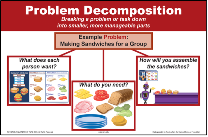
- An example, each related to the same, simple theme — making sandwiches
- Minimal text in a clean font
- Carefully selected words, used consistently across the materials — e.g., Attributes and Values, which are specific terms used in CT and computing
- Additional color coding
- Carefully selected and assembled images
- Repeated elements within and across posters
- No extra elements
The programs’ Educator Guides refer to these posters, prompting teachers to point to and draw from them as part of various activities. And students are encouraged to use the posters as well, both as sources of information and as scaffolds for their work.
As a result of teacher input and classroom observations, we also offered another, very different set of posters for the same content.
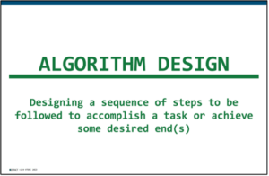
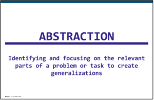
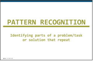
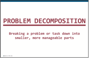
Without the examples, they provide less information, but they are easier to read — especially at a distance — and they are less visually cluttered. In certain situations and/or for certain learners, this is exactly what is needed; no more, no less.
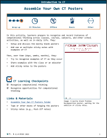
And finally, inspired by one of our CodePlay teachers, we designed an activity to help teachers and students assemble their own CT posters. This teacher had her students record their own examples of CT practices whenever they occurred in the classroom. Did a homework assignment require breaking a task into smaller parts? Record that example on a stickie note and attach it to the Problem Decomposition poster. Did someone notice that rearranging the desks required pattern recognition? Add another stickie note to that poster. This gave the students ownership of the ideas, as they began to recognize these skills and practices throughout their days, and as they added their own examples to the growing display.
- If you’re a teacher, what’s on your walls? Can you improve the offerings? Make better use of what is there?
- If you’re a parent, guardian, or similar, what resources do you have around? Can you and your kid(s) identify ways to expand or improve what is available?
- If you’re a learner, what design elements are helpful for you? Which causes challenges? Are there ways for you to request or make design changes that will help you learn or demonstrate your learning better?
Coming soon in the Designing by, with, and for Neurodivergent Learners series:
Part 3 — Zoombinis Allergic Cliffs Flashlight Scaffold
Part 4 — Zoombinis Allergic Cliffs Expression Scaffold
Part 5 — Brightness Controls
Part 6 — Red Alert
Part 7 — Word Cards
Part 8 — Anatomy of Activities
Educational posters seem to be everywhere. Some are well designed, others not so much. A poorly designed poster fails to communicate clearly, with such design mistakes as using hard to read text, distracting backgrounds, cluttered layouts, or unnecessary or confusing images. We made a conscious decision to carefully design our posters, as poor designs are never good, but they can be especially problematic for some neurodivergent learners.
As part of two projects, CodePlay (NSF; #1738574) and INFACT (DOE; EIR-U411C190179), our teams carefully designed several sets of computational thinking (CT) posters for teachers to not just hang on their walls, but to refer to and use in their lessons.


The posters were thoughtfully designed.
- A single topic on each poster — key CT topics
- A consistent structure across the posters:
- A color-coded band across the top, with the color for each term used across all the materials
- A clear header — the CT term
- Minimal, simple text — a definition of the term, used across all the materials
- An example, each related to the same, simple theme — making sandwiches
- Minimal text in a clean font
- Carefully selected words, used consistently across the materials — e.g., Attributes and Values, which are specific terms used in CT and computing
- Additional color coding
- Carefully selected and assembled images
- Repeated elements within and across posters
- No extra elements
The programs’ Educator Guides refer to these posters, prompting teachers to point to and draw from them as part of various activities. And students are encouraged to use the posters as well, both as sources of information and as scaffolds for their work.
As a result of teacher input and classroom observations, we also offered another, very different set of posters for the same content.


Without the examples, they provide less information, but they are easier to read — especially at a distance — and they are less visually cluttered. In certain situations and/or for certain learners, this is exactly what is needed; no more, no less.
And finally, inspired by one of our CodePlay teachers, we designed an activity to help teachers and students assemble their own CT posters. This teacher had her students record their own examples of CT practices whenever they occurred in the classroom. Did a homework assignment require breaking a task into smaller parts? Record that example on a stickie note and attach it to the Problem Decomposition poster. Did someone notice that rearranging the desks required pattern recognition? Add another stickie note to that poster. This gave the students ownership of the ideas, as they began to recognize these skills and practices throughout their days, and as they added their own examples to the growing display.

- If you’re a teacher, what’s on your walls? Can you improve the offerings? Make better use of what is there?
- If you’re a parent, guardian, or similar, what resources do you have around? Can you and your kid(s) identify ways to expand or improve what is available?
- If you’re a learner, what design elements are helpful for you? Which causes challenges? Are there ways for you to request or make design changes that will help you learn or demonstrate your learning better?
8/25/2025
AuthorTeon Edwards is the director and a co-founder of EdGE at TERC. Her current work focuses on the use of virtual reality and other technologies to design and develop inclusive STEM learning experiences, with a particular focus on neurodiversity and sensory, attention, and social differences.
SummaryTeon Edwards, PI of Broadening Participation in Informal STEM Learning for Autistic Learners and Others through Virtual Reality, explains the thoughtful design of educational posters.
More Posts from this Series
Share This Page:
